CheckboxProps
The checkbox widget allows users to create and render native checkboxes in the app. This widget is based on NodeGui's QCheckBox
Usage#
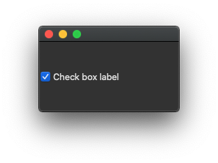
What it looks like?#
Props and styling#
You can find all the props vn-checkbox accepts listed below.
Apart from this, you can take a look at the styling
and event handling docs
Hierarchy#
AbstractButtonProps
↳ CheckboxProps
Index#
Properties#
Properties#
Optional checked#
• checked? : undefined | false | true
Sets whether the Checkbox border is raised. QPushCheckbox: setFlat
Optional enabled#
• enabled? : undefined | false | true
Inherited from ViewProps.enabled
Sets the property that tells whether the widget is enabled. In general an enabled widget handles keyboard and mouse events; a disabled widget does not. QWidget: setEnabled
Optional icon#
• icon? : QIcon
Inherited from void
Sets an icon in the button. QPushButton: setIcon
Optional iconSize#
• iconSize? : QSize
Inherited from void
Sets an icon size in the button. QPushButton: setIconSize
Optional id#
• id? : undefined | string
Sets the object name (id) of the widget in Qt. Object name can be analogous to id of an element in the web world. Using the objectName of the widget one can reference it in the Qt's stylesheet much like what we do with id in the web world. QWidget: setObjectName
Optional mouseTracking#
• mouseTracking? : undefined | false | true
Inherited from ViewProps.mouseTracking
Sets the property that tells whether mouseTracking is enabled for the widget. QWidget: setMouseTracking
Optional style#
• style? : undefined | string
Inherited from ViewProps.style
Sets the inline stylesheet property. QWidget: setInlineStyle
Optional styleSheet#
• styleSheet? : undefined | string
Inherited from ViewProps.styleSheet
Sets the property that holds the widget's style sheet. QWidget: setStyleSheet
Optional text#
• text? : undefined | string
Inherited from void
Sets the given text to the button (Used as an alternative to children). QPushButton: setText
Optional visible#
• visible? : undefined | false | true
Inherited from ViewProps.visible
Shows or hides the widget and its children. QWidget: show
Optional windowOpacity#
• windowOpacity? : undefined | number
Inherited from ViewProps.windowOpacity
This property holds the level of opacity for the window. QWidget: setWindowOpacity
Optional windowTitle#
• windowTitle? : undefined | string
Inherited from ViewProps.windowTitle
Sets the window title property. QWidget: setWindowTitle